

Making your site truly responsive and accessible is hard. The most popular web browsers available have their limits for development and designing purposes. Unless you can use a proper native mobile browser you will never be able to simulate the real devices, sync the scrolling position, take full-page screenshots, and see where the bottlenecks are.
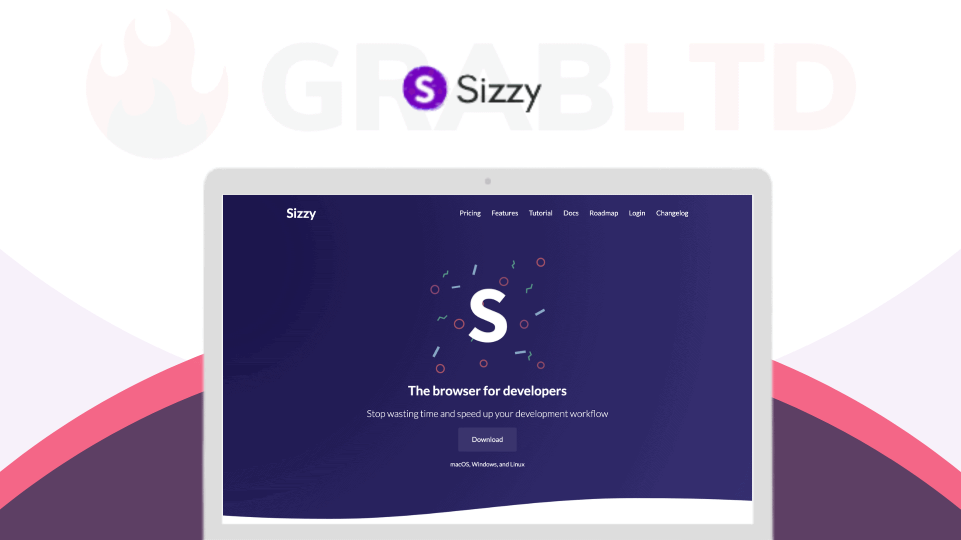
Sizzy is a browser made specifically for responsive development and designing. It helps you to make your site responsive, fast, and accessible while speeding up your development workflow by 5x and making sure your site looks perfect on all devices.
This tool has some brilliant features that will make your panic about testing your website on multiple platforms a thing of the past.
Everything is in sync – Scroll, click, or navigate to a different url, and all the devices will follow.
Screenshot, the proper way – Take a screenshot of the current viewport, or the entire website. You can also screenshot all devices at once. With, or without a device frame. So many possibilities!
Universal Inspect Element – Inspecting devices one by one can be a chore, so Sizzy includes Universal Inspect Element which allows you to inspect all devices at once.
Realistic Devices – Sizzy has the most accurate device simulation. It simulates the device frame, the UI for the browser & OS, and you can completely customize everything.
Used By The Fastest Growing Companies Across The Globe
Stop wasting time and speed up your development workflow!!


